
Everything in Nama ERP happens in a browser. There is no client to install and nothing to keep in step across machines: the person approving a purchase order on a laptop, the storekeeper receiving it on a tablet in the yard, and the accountant closing the month on two monitors are all looking at the same application, drawn to fit the screen in front of them.
This article describes that interface as it stands today. An older interface still exists for installations that have not moved yet, and it can still be switched on for a user who needs it — but it is no longer the one that receives work, and the description below is the one to plan around.
It looks the way each person wants it to look
The interface ships with a set of named themes, and each theme carries two palettes — one light, one dark. Choosing a theme is a per-user decision, made from the user’s own settings, and it takes effect immediately without an administrator being involved.
Alongside the theme there is a display density: normal, compact, or ultra. Density decides how much padding sits around every row, field and button, and therefore how much of a document fits on screen before anyone scrolls. A data-entry clerk working through a hundred lines an hour and a manager reviewing five documents a day do not want the same answer, and now they do not have to share one.
Fonts are set separately for the body of the screen, the menu, and disabled fields — that last one on purpose, because a user needs to tell at a glance that a field is read-only rather than broken. The login background can be defined at seven levels: global configuration, legal entity, sector, branch, department, analysis set, and the individual user. You put those levels in the order you want them consulted and the system uses the first that actually has an image, so a group of companies can show each subsidiary its own branding while still letting a user override it.
Finding the screen, then finding the record
The main menu sits in a sidebar that can be pinned open on a wide screen or left to collapse on a narrow one, and it can be shown either as a full tree or drilled into one level at a time. It is searchable: type part of a name and the matching entries surface, wherever they sit in the hierarchy.
Inside a list view, the search bar finds records by code or name, and quick filters do the rest. These are buttons across the top of the list built from the values that actually occur in your data, each one carrying the number of records behind it and its share of the total — so the filter tells you something about the population before you have clicked it. An administrator can also define quick filters from a criteria expression, grouped into labelled boxes and titled in both Arabic and English.
The quick filters guide covers how they are configured.
Lists you can shape
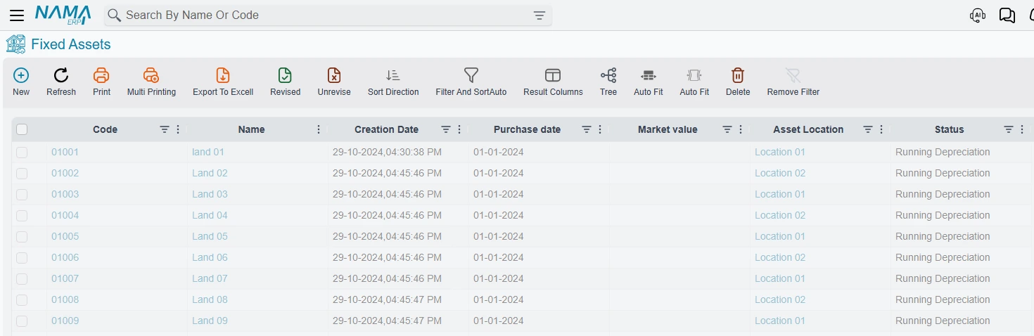
Every list view is a grid you control rather than a fixed report:
- Filter and sort on any column from the column’s own header, with the filters combining across columns.
- Reorder columns by dragging, and pin the ones that should stay put while you scroll sideways.
- Show and hide columns, and keep the result as the set that screen opens with.
- Fit columns to their contents in one action, or to the width of the window.
- Set the page size and page through the result with the total record count in view.
- Export what is on screen to Excel, or send it to a printer — including printing many selected records in one pass.
- Open the same data as a tree where the records have a parent-child relationship.
Selecting rows is the entry point to acting on them: revise or unrevise a batch, delete a batch, or edit one field across everything you have selected.
Documents built for typing, not clicking
The 2024 version of this article was pleased to report icons for adding, copying and deleting grid lines. The icons are still there, but the faster path is the keyboard and it is worth learning:
- Insert adds a row after the current one; Ctrl + Insert copies the current row into a new one; Ctrl + Alt + Insert copies it many times, asking how many.
- Ctrl + Delete removes the current row.
- Arrow Down in a cell moves to the next row, and creates one if you are on the last.
- Alt + F opens a find bar over the grid you are in.
- F9 on any field shows its help.
The full shortcut list has the rest.
When something is wrong the screen says so in place: incomplete required fields are marked, and hovering one explains what it wants. Colour carries meaning in detail grids too — the three nesting levels, free lines, lines generated from another line, returned items, and lines already sent to an external system each have a colour you set, so a reader can see the shape of a document before reading it.
A reference field you are filling can create the record it needs without leaving the document, and can open the record it points at for a quick edit in a popup.
The screen is not fixed
Everything above is how the interface behaves as delivered. The Screen Modifier is how an installation changes it: hide fields, rename tabs, move a group to another page, add a column to a list, define quick filters — for one screen, for a named set of screens, or for every document in the system. There is a visual editor for it, so a layout is arranged by looking at it rather than by describing it.
None of this is code, and none of it is a fork. Nama keeps the original screen intact and applies your instructions on top of it each time the screen is built, which is why an upgrade does not undo the work. See the Screen Modifier documentation.
What else lives in the bar at the top
- Approvals — what is waiting for you, with the document one click away.
- Notifications — arriving live over an open connection to the server rather than on a refresh.
- Dashboards — charts and tables built in Nama’s own designer against the live database, with cross-filtering and right-click drill-down that carries its filters into the next chart. The BI guide covers what they can do.
- The AI assistant — answering from your data and running your reports, but only through tools an administrator has defined, and always as a real user with the full security model applied. It cannot reach anything that user could not open. See the assistant documentation.
- Language — Arabic and English, switched in place, with the whole interface mirroring for right-to-left.
On a phone or a tablet
The same application serves a small screen, and one setting decides what a grid becomes there. Detailed grids keep the full table, which suits someone checking figures; the card layout is easier to tap, which suits someone capturing a few fields between stops. Choose by what your mobile users actually do — the answer is rarely the same for a driver and a financial controller.